Friday, May 30, 2025

What is good?


Everything is design. The work of Paul Rand defined modern design.

A short retrospective film created more than 20 years ago for American design icon Paul Rand's induction to The One Club Hall of Fame, by LA-based design studio Imaginary Forces, encapsulates a few of Rand’s greatest insights. The audio for the piece came from a 1997 interview, "Conversations with Paul Rand". As a designer, I was very aware of Rand's work (not to be confused with American politician Rand Paul), but wasn't as familiar with his writing or teaching. Born Peretz Rosenbaum in 1914, in Brooklyn, Rand (who later changed his name either due to misspellings or to avoid bias) took a $25 certificate course at the Pratt Institute to study art. Today, a semester at Pratt can cost $30 K. After extending his studies at the Parsons School of Design (another revered school) he began his career in 1932. This is really the very early days of design as a profession, from graphic design, industrial design, to interior design, when design specialties began appearing. This generation of designers created the practice and principles that define those professions today. Apart from being an influential designer, Rand was also a remarkable teacher. His belief that design should be visually pleasing as well as functionally effective drove his work for magazines, advertising and most memorably, logo design. His many mantras, such as “Simplicity is not the goal. It is the by-product of a good idea and modest expectations,” demonstrate that he also had a knack for capturing heady ideas in a simple, concise fashion.

Read more »

Labels: , ,

Friday, May 16, 2025

Propagandanista


Propaganda? Advertising? Art?

"All art is propaganda.", or so wrote George Orwell.

"All art is political", so said Mao, or was it Hitler? Or Donald Trump?

"(The Movie industry) is, in addition to everything else, messaging and propaganda!"
Ah, yes, that was The Great Pumpkin.

The origin of the word propaganda comes from the efforts of the Catholic Church to "propagate" the faith. From Congregatio de Propaganda Fide in 1622. Thus, in simplest terms, whatever messages and meaning you wish to promote, and how you do it with material you create and disseminate, artistic or otherwise, is propaganda. Radio broadcasts, music, theatre, film, art, advertising… think of all the possible swag you can get from a conference. That's propaganda. It took on a negative connotation when governments created extensive information programs, especially between the Great War and World War II. That political relationship and the advent of the profession of Public Relations cast a malodorous pallor over the word and the tactic of using any means necessary to inform (or more particularly, to misinform) the public.

Read more »

Labels: , ,

Friday, May 02, 2025

Headphones & Hoodie


Image from user louisponce on Midjourney.
“Genius is 1% inspiration and 99% perspiration.”

I’ve entered a new phase of my work-life balance, in that I’m really trying to find a balance that is more life-life. I am spending far more time calculating when work can end and life can begin. Scientists have speculated that life began about 4.5 billion years ago, but for me I’m ready to kick off in the late afternoon, early evening at the latest. Yes, I’m spending a lot of my time matriculating when I can retire.

I say “retire” but I really mean stopping working for someone else and starting doing the things I want to do for once. How many years do you have to keep doing someone else's projects before you can start working on your own? Of course, I ask this from a place of privilege. I've worked for over 30 years and for many of those years I've contributed to retirement savings plans and other investments. Some years (the 2008 financial crisis say) a lot of those savings were wiped out, and other years economic downturns have wreaked havoc on those plans. That's sort of what's happening now. Economically speaking, "Orange" is the new red; a chaotic American administration is destroying markets and all of my savings are in those markets. Also, it’s not a good time to have Canadian dollars and portfolios of stock made up of companies that are leaking value with every fart from below the 49th parallel. The losses are such that I should probably put the retirement abacus aside and focus on getting back to work.

Read more »

Labels: ,

Monday, July 08, 2024

St. Sammy Peeps 


Samuel Pepys, Portrait by John Hayls, 1666

At this year’s TCAF (the Toronto Comic Arts Festival), I saw a talk given by Rosena Fung about her book “Age 16”, which is a work of fiction that borrows from her own life. It wasn’t an autobiography or memoir but clearly her personal experiences helped imbue her characters with a certain truth. In talking about her work she mentioned how she created a lot of “self documentation”.

Of course, I could empathize. For over twenty years, I’ve maintained a blog. For 17 years I’ve taken entries from that blog and published an annual compendium. Since I’ve owned a smartphone I have taken random photos that I have kept that not only record an image, but the exact time, date and usually a geographic location (my iCloud album goes back 22 years). For the last 9 years I’ve kept sketch books, which started as a daily way to keep up my sketching and use up empty sketchbooks. I now have 14 of them. Since 2010, I’ve kept my work notebooks (this is surely something that I could give up). I have letters and other sketchbooks that go back to the 1990s. After maintaining a blog for over twenty years and a comic book journal for almost ten, my remarkably dull and inoffensive journaling is more like a public "notes to self" than a really honest and insightful diary. I've also started logging my workouts, keeping track of what I eat, allowing Google Maps know my location and I've started using Apple's Journal app (and may occasionally use the Kennedy app which does pretty much the same thing). While none of these are revealing any deeply held secrets or worrying psychosis, they certainly are a record of self-documentation, perhaps of the dullest kind.

I’ve since learned from David Owen’s New Yorker piece, How To Live Forever, that this self-recording is known as solipsism. “Solipsism (from solus 'alone', and ipse 'self') is the view or theory that the self is all that can be known to exist. As a position, solipsism holds that knowledge of anything outside one's own mind is unsure; the external world and other minds cannot be known and might not exist outside the mind.”
- Wikipedia

Read more »

Labels: , , ,

Sunday, September 24, 2023

On Art 

“I just liked the look of it and thought it was funny to put it on the wall.”

Again this year I passed on Toronto's all night art thing, Nuit Blanche. It used to be an important date on my calendar until I just grew tired of the crowds. I particularly grew tired of crowds at any interactive art piece, where mostly the audience participation involved taking photos of themselves to post on social media. That's not to say I no longer think about art. What I wrote below was written in the café at the Art Gallery of Ontario after an afternoon of ambling through its galleries.

The more the merrier.
More is not always better. Much of modernity is a Minimalist act (in spite of maximum consumerism), famously encapsulated by the credo, "less is more". Sometimes art is nothing more than a moment but there is also a lot of art where there are so many ideas packaged so deeply into a single piece that no idea emerges at all. Is a work the piece itself, the performance during its creation or the personal essay that accompanies it?

So much self examination.
There seems to be so much discussion of the uniqueness of hybrid lives (I am indigenous-, Polish-, gay-, straight-, Canadian etc). I understand the language of the "multi-hyphenate", but sometimes I think some artists should understand that the search for their identity, be it a stage of their life or a life-long quest, while a personal interest, just may not be that interesting to other people. They should also accept that lack of interest isn't a rejection of anyone's identity. Sometimes your audience isn't rejecting you, they are just saying your journey of self-discovery is boring. We are all multiples of ourselves (mothers, sisters, professionals, friends). Self-expression has self-examination built-in, no? Can you have one without the other? In any respect, it feels like there might be too many "journeys of identity" taking up space in our limited galleries. 

Colonization.
While Colonization is often considered where a white culture overwhelms, suppresses, destroys or seeks to control an indigenous one, it shouldn’t be forgotten that within Europe there are many cases of white colonizers attempting to erase neighbouring white populations. (Russian v Ukrainian for example). Not to mention the definition and inclusion of "whiteness" has historically changed. At one time Toronto was seen as an Anglo-Saxon Protestant town excluding all other groups, namely Jewish, Catholic, Irish, or Italian, who would all eventually be considered some flavour of white. Basically, it's good to know the time, place and context of any art you are consuming to understand whether it is an act of colonization or a reaction to it.

On exoticism
We sometimes “other” those different than ourselves both in a discriminating way or in a fetishized way. Both are objectifying. The art of any given culture, but particularly the art in European institutions is not just evidence to this but a map to what was considered "exotic" or "other". I like to wonder what caveats we will have to give contemporary art in 50 years. 

What does it mean?
Art does not have to mean something. Why can’t there simply be a formal exploration of image or sound or whatever? I have a paper shooting target framed and hanging on my wall and I’ve been asked “What does it mean?” My guess is this question comes from an over interpretation of art from Rembrandt to Pollock. If you ever were shown art in a class in school, the teacher probably read in their course syllabus that this art had "the following symbols and meaning". I don't just mean art shown in an art class, but any class like history or geography. In my case of owning a shooting target, I could argue that framing and hanging a cheaply produced graphic meant to practice marksmanship was an act of “recontextualization” - changing its context from a bit of performative violence (the act of shooting) to a contemplative consideration as art. But the truth is I liked the image, the form, the balance and proportions of the figures in what to me looked as much like a music poster than as disposable collateral for target practice. Or I could recognize that someone who used it for shooting practice might save it as a souvenir if they had shot well and I saved it as souvenir of never having shot anything at all.

Mostly though I just liked the look of it and thought it was funny to put it on the wall.

Labels: ,

Monday, May 15, 2023

70-year-old Salt Peanuts 


It was 70 years ago today.

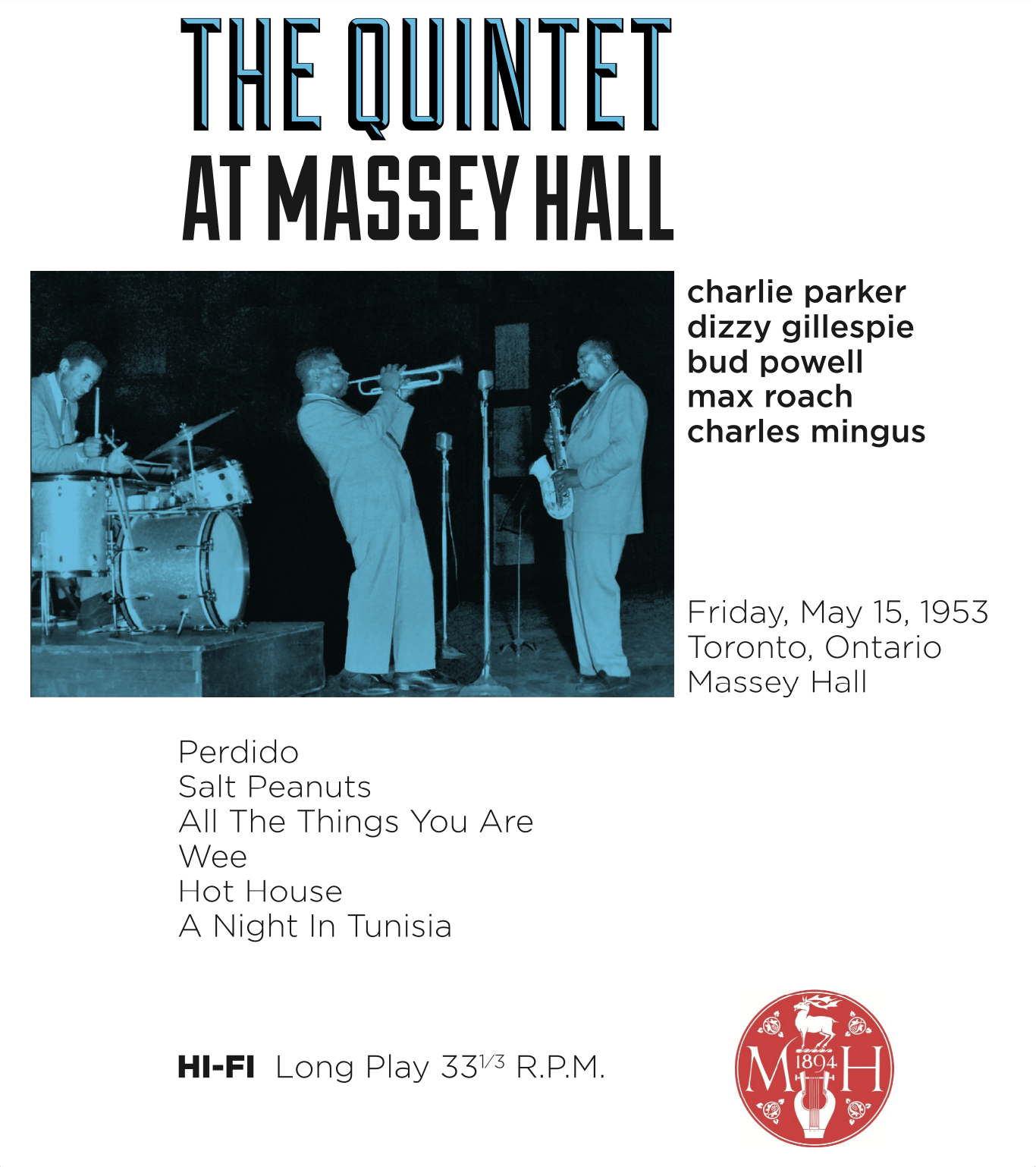
In 1953 the US and Soviets announce they have the Hydrogen bomb marking the beginning of the Cold War. Eisenhower becomes president of the United States. Khruschev becomes head of the USSR. Marilyn Monroe, Mickey Mantle and Eddie Fisher are the pop stars of the day. Rocky Marciano and Jersey Joe Walcott are dueling heavyweights. Edmund Hillary and Tenzing Norgay ascend Mt. Everest. The first colour television set would go on sale and 70 years ago today, one of the greatest Jazz concerts of all time happened at Massey Hall in Toronto. Charlie Parker, Dizzy Gillespie, Bud Powell, Max Roach and Charles Mingus played to a small crowd due to logistical mistakes and an underwhelming, amateur promotion. The show was undersold and mostly unknown until Mingus later released the recordings as Jazz at Massey Hall.

Billed by jazz critics as "the greatest jazz concert ever," the May 15th, 1953 concert almost never happened. The quintet of Jazz legends Dizzy Gillespie, Charlie "Bird" Parker, Max Roach, Bud Powell and Charles Mingus had never rehearsed or even had a sound check when they made history that night. There are so many stories about this concert. Dizzy Gillespie and Charlie Parker arrived later than everyone else as Parker was late arriving at LaGuardia in New York, and Mingus' wife, who was an unexpected guest, bumped Gillespie from the flight to Toronto because Mingus insisted she accompany them. That night, Charlie Parker played on a plastic Grafton Alto sax as he had probably hawked his own to support his drug habit. Bud Powell on piano appeared stone cold drunk or in some kind a trance. Did it matter? No one played Bebop piano better. Max Roach fearlessly set the pace and always brought out the best in Parker. Who knew Charles Mingus would later dub over his own bass parts? Dizzy seemed more concerned about the outcome of the Marciano/Walcott title bout than the gig as he ran to a tavern across the street during intermission to check in on the fight.


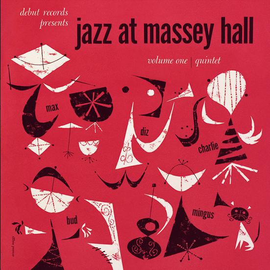
The original album cover for Jazz at Massey Hall, designed by Canadian artist Arnaud Maggs, 1953. © Estate of Arnaud Maggs. Courtesy Susan Hobbs Gallery.

Despite the more popular notion that the early 50's represented a benign American polyannaism, it was more truly a period of creative blossoming and experimentation, especially in areas such as architecture, industrial & graphic design, illustration, painting, photography, poetry, film and music, especially Jazz.

Labels: , ,

Friday, June 10, 2022

Monkfish 


A comparison of a squid with sea monks from the sixteenth century shows that in olden times, fisherman had very vivid imaginations.

My Chinese zodiac is the year of the monkey, with the element of earth making me an earth monkey (I assume). A superficial description of my character traits are as follows:
"They are optimistic, confident and have strong initiative. They have high intelligence, quick reaction ability, and strong adaptability to environmental changes, so they can handle any urgent and complicated matters calmly and clearly. They like socialization and are warm-hearted, so that they can get along well with others.”

My astrological sign is Pisces which is described as:
“They dream on such a lofty scale that their reach often exceeds their grasp. [These] people enjoy living in the limelight and gravitate toward a fast-paced lifestyle that offers them glamour and romance. Pisceans hold on to their memories from childhood, good or bad. Even if they feel burdened by the past, it is almost impossible for these sensitive souls to cut themselves off from family. They make conscientious parents. They know how to foster an an atmosphere of liberalism and good times. They have an instinct for making money. They have the ability to stay within a tight budget.”

Comparing the zodiacs of Persia and Asia, one makes me out to be a monkey of the earth who will not make a great fortune and be unhealthy, while the other says Pisces is a water sign and fortunes are to be mine because I’m good with money. Maybe I am both, of the earth and the water. A monkey and a fish. A monkfish, if you will. I readily admit my mind is sometimes a laughing monkey. Other times it is a sleeping monkey. Sometimes it is that monkey picking and eating ticks from the coat of another monkey. Still other times, it is that monkey who sits in the corner of the compound, quiet, bored, crouching in a slump and scratching his ass.

Read more »

Labels:

Wednesday, August 08, 2018

Design is a Verb 


Amik, designed for the 1976 Montreal Olympic Games, George Huel, Yvon Laroche, Pierre-Yves Pelletier and Guy St-Arnaud.

Seeing the documentary Design Canada opened a bit of an old wound for me. One where I remembered that time in frustration I acted like a bit of a jerk. The film highlights the quality of graphic design work, primarily in the "international" or "Swiss" style. It showcases roughly a decade of Canadian design from the early 60s to the late 70s. Primarily the time just before Expo 67 and the time just after the 76 Montreal Olympics. This was a tremendously optimistic era for Canadians and several important symbols for Canada and Canadians came to life. In 1960 the Canadian National railway were convinced of needing an entire brand identity system and not just a logo. From those efforts came Allan Fleming's classic CN logo. Only a few years later a committee was struck to determine a new original flag design for Canada based on the maple leaf. By some miracle, a committee of politicians and bureaucrats actually choose a great design, which was later carefully crafted and fine tuned by a small design team.

These two designs seemed to be the beginning of a genuine emergence of talented designers making great work in Canada. Well, to be fair, talented European men who had come to Canada and worked from Toronto and Montreal. In most respects, this wave of talented immigrants and the work they did is the story of Canada. We are nothing if not a community of communities. In fact, I would stop there when describing any kind of Canadian Character or … ugh, I hate this expression but here goes, "Canadian Identity". Therein lies the salt in my old wound.
“…did these symbols, in fact, design Canada?”
When I studied design, almost the entire staff consisted off immigrant Canadians from places such as the UK, the Netherlands and Poland. It was great and really eye-opening for a Newfoundlander to meet and learn from these fine fellows. Except, it grew very tiring to hear of the golden age of Canadian Design (and in particular of the federal agency Design Canada - never mentioned in the film of the same name) as having come and gone. Yup. It was over. Oh those halcyon days were so fine and never to be repeated. Rather than imbue their students with the confidence to create from their own world view, they instilled a cynicism that took a generation of young Canadian designers to shed. I also grew very tired of having the Canadian Identity explained to me by these guys. There certainly is a truism that "newcomers" have a unique view of their adopted land and that is immensely valuable. Yet the view they had was one of the two solitudes of Protestant Ontario vs Catholic Quebec or even more succinctly put, TO vs MTL. The view of the teaching staff - even the Canadian born ones - was so incredibly myopic, they had no idea of the insult they gave every time they extolled the Canadian virtues embodied in maple syrup and Muskoka chairs. So, as a young man I routinely struck back. One thing I said then, to a particularly disagreeable Anglo-Canadian was that I was tired of "having a bunch of old European guys lecture me on what the Canadian Identity was". That came out wrong - I may have even been more forcibly insulting and said "old foreigners" - which was shamefully more xenophobic than ever intended. If a 20-year-old woke bi-racial woman asked "Why should a bunch of old white European men tell me what my identity is?" it would go viral today. That certainly wasn't the case then and in truth, I wasn't offended by "foreigners", but by Ontarian and Quebecois identities being offered as some kind of ethnic simulacrum of "Canadian Identity". What I really meant was I was fed up with "mainlanders" telling a Newfoundlander that to be Canadian was to drink beer while eating maple soaked bacon sitting on a rock in Northern Ontario, listening to Neil Young. Or as Brent Butt put it, the all-Canadian story is that of a Moose who wants to play in the NHL but his father wants him to take over the canoe factory. People in places like Newfoundland, Quebec, the Yukon or New Brunswick never really have to ask "what is the Canadian Identity?" because they know that is a telling question fielded largely in by Southern Ontarian media concerns.


Parks Canada,c. 1970 Roderick Huggins.

This attitude was distilled in a line from the documentary, "…did Canadians design these symbols or did these symbols, in fact, design Canada?" Okay, dear designer, climb down from thine lofty perch for a moment. Was the period from Expo to the Olympics a golden one? Undoubtably. Were these designers working at the highest level, creating some of the best graphic design anywhere in the world? Yes. Did those symbols create our identity as a nation? Not so fast, friend. I would agree that era, particularly after WWII, Canada was an optimistic, progressive, forward looking, history-unshackling place of nation builders with growing self-confidence. That socio-economic moment combined with a generation of designers who, as another designer in the film states, were essentially "Swissed" or worked in a very disciplined "International Style" led to that moment. To me, the fact that the CBC accepted a great modern icon or that the government commissioned and chose a really great icon for introducing the metric system was a reflection of a country that was forward looking and bold. The design activity of the time reflected our confidence and our imagined place in the world which in general is what we can say of most media, visual art, or literature created during any historical period. Compared to recent updates of the Ontario Trillium icon, the CBC logo or even the Parks Canada icon, which reflect a contemporary fad of "re-branding" and creating symbols designed to avoid offence, the graphic design of the 60s and 70s was bolder, more adventurous and more disciplined. When we see contemporary designs that look like they fell off of a clip art truck that reflects a lack of desire to pay someone the time to come up with something better or that the decision makers of those corporations lack the knowledge or resolve to make better decisions. If we are in some kind of current design doldrums (and who says we are) it may be more due to the abundance of branding firms doing so much work simply to justify their existence. Whatever the case, can we just stop calling what happens in Toronto and Montreal, our "Canadian Identity" because it never was, never should be and never will be.

Labels: , , ,

Saturday, February 10, 2018

Seen in… January 


Harold Lloyd doing what he does best - creating an iconic movie moment. Image via The Movie DB.

Britain's darkest hour may have been in the spring of 1940 but for Canadians it is deep in the heart of winter. Winter can be a wonderful and magical time of year – if you are between the ages of five to ten years old. Unfortunately the rest of us have to shovel and plow our way to work and back. You wake in the bleak darkness and arrive at your place of work with what can be best described as a brightening greyness. In Toronto, winter is a time when the sky is an even and unbreakable grey. It's time to go home when you glance at the window only to see your own face staring back from the blackened glass. You wake and go home in the same unforgiving dark. It's a surprise I left the house at all, but between volunteer engagements, meetings and advocacy bike rides I did manage to get to the theatre and see a few films at home.


Gary Oldman poisoning himself.Image via The Movie DB.

Darkest Hour

This film is about the dark days of May 1940 when Nazi forces had advanced so quickly through Europe they simply shocked their foes and the majority of Britain’s army were trapped on a beach in France without any way out. Within the British government Winston Churchill had just been appointed prime minister and was being pressured to negotiate with Hitler via Italy. Churchill sees no way of winning as he rightly argues you can’t “negotiate with a tiger when your head is in its mouth.” When the near miraculous evacuation of Dunkirk offers a spark of hope Churchill delivers his famously rousing speech in the House of Commons: “We shall fight on the beaches, we shall fight on the landing grounds, we shall fight in the fields and in the streets, we shall fight in the hills; we shall never surrender” which led one parliamentarian to quip that Churchill had weaponized the English language. The speech led to support of Churchill and a turning point that led to the Battle of Britain. The thing about this film is, that not for one second do you think, “Wow Gary Oldman is really a lot like Winston Churchill”. You simply forget there is a Gary Oldman at all as he so completely inhabits the makeup and mannerisms of someone so iconic and renders him full of doubts, resolve and humanity. If this performance doesn’t win Oldman the Academy Award then nothing will. The film is surprisingly gripping despite being a war movie set almost entirely in smoky rooms of government offices and war rooms. Having seen Christopher Nolan’s taut rendition of the Dunkirk evacuation only heightened the urgency playing out behind large dark oak doors of the British establishment.

Dirk Gently’s Holistic Detective Agency Season 2

Despite bingeing through this series like a starving man at an all you can eat Mandarin buffet, it really wasn’t as profoundly quirky or holistic as season one. In a strange way it seemed almost too fantastical. I think this series works best when Dirk and the gang fall into the weird little coincidences that are too weird to be just a coincidence but at the same time might just be the only way to explain what’s going on.

I don’t feel at home in this world anymore

I watched this Netflix original about a woman who takes vigilante justice to the next level after her home was robbed, mostly because Elijah Wood appeared to be playing the same lost loner as he plays in Dirk Gently’s Holistic Detective Agency. He was so similar that I briefly thought this movie was a cross-over with the other show, also a Netflix original. Melanie Lynskey is Ruth who reaches a type of tepid simmer and tired of being knocked about by life sets out to take back a single iota of control. Her neighbour, Tony, played by Wood is so purposeless that he jumps at the opportunity to do anything at all. What seems at first to be perhaps a quirky mystery or buddy movie morphs into something less funny and more dangerous which is what makes the movie interesting. Beneath the humour is a menace and yet the fact that the people who are so menacing are also so pedestrian is what makes it all the more creepy. So this movie is quirky, funny and creepy… if that helps at all.
Read more »

Labels: , , , , ,

Thursday, November 09, 2017

FYI WFH 


Working alone is like… Alain Delon in Michelangelo Antonioni’s ‘L’Eclisse’ (1962)

Every once in awhile, maybe every other week I WFH - work from home. The custom of sending a wide e-mail informing co-workers of this pretty much ended years ago. Actually about three or four times a week I SWFH. That is I "Start Work From Home” due to early morning conference calls but then head into the office. It is pointless to tell anyone about this because to the majority of my colleagues, many of whom I’ve never met, I am nothing more than a crackling, fuzzy and distant disembodied voice. They live and work on another continent. When I do go into the office those sitting near me are also working with people on other continents that they’ve never met. We sit side by side with fingers on keyboards playing chords of code sent all over the world to people we neither know or recognize. So why do I go to the office at all?

Funny you should ask. In the last two weeks I’ve attended two different conferences, one focused solely on the technology of artificial intelligence and the other focused on design issues, namely the practice, business and art of design. While the practical side of attending conferences is to improve your skills and knowledge while discussing processes and business with your peers, I think I like to go to prove I exist. Talking to other people feels like it proves I exist as if I were a ghost surprised that the residents of a dwelling I haunted could suddenly see me when for years no one else had. This is essentially why I go to the office to work. I need to see other people who see me to prove to myself that I exist. Sure you could call it “social interaction” but whatever you call it, it is worthwhile to prove my existence. Read more »

Labels: ,

Thursday, September 07, 2017

Creativity Killjoy 


Samuel Taylor Coleridge probably thinking about opium, image via The Times

Kubla Khan
Or, a vision in a dream. A Fragment.


In Xanadu did Kubla Khan
A stately pleasure-dome decree:
Where Alph, the sacred river, ran
Through caverns measureless to man
Down to a sunless sea.
So twice five miles of fertile ground
With walls and towers were girdled round;
And there were gardens bright with sinuous rills,
Where blossomed many an incense-bearing tree;
And here were forests ancient as the hills,
Enfolding sunny spots of greenery.

But oh! … [knock on door]

that deep romantic… [knock on door, harder now]

chasm that flowed, crap, no… Chasm which [more knocking on door]

Oh for FU… “HANG ON!”

There is a story, most likely apocryphal, that Samuel Coleridge had many more stanzas of his famous poem in mind but was disturbed from his reverie by an insurance salesman knocking on the door. It’s probably more likely that Coleridge’s opium high dissipated, thus ending a soaring stanza-generating drug fuelled high. Downer, man.
Read more »

Labels: , ,

Sunday, August 20, 2017

Daring and Devilishly Good 


Marvel's Daredevil image via theMovieDB.org

I wouldn't describe myself as a Marvel fan-boy nor an aficionado but I did grow up reading the Spider-man and Daredevil comics of the 70s when Hell's Kitchen really was a crime riddled neighbourhood and I was enthralled by Frank Miller's re-imagining of characters like Batman and Daredevil in the 90s. What I loved about those original Marvel comics were their placement in the real world of New York City and the interconnectedness of the heroes (now often referred to as the Marvel Comics Universe or MCU).

Now comes the Netflix series of Marvel stories which are unique to the oeuvre in how rooted to a real time and place they seem. Every thud or punch thrown is felt like a cracked rib. The characters eschew spandex costumes and logos and fight in gritty urban streets, rooftops and alleyways. Just as each of the series revolve around a singular character like Matt Murdoch, Jessica Jones or Luke Cage, (I’ll exclude Iron Fist for now, due to its failings) each show has its own look and voice despite being connected thematically by shared characters. Each show also has its own colour palette.


Daredevil. Interior, Indian Restaurant.

Instead of yellow boxes filled with hand-lettered captions, or thick black frames, these shows use colour to thematically and spiritually connect them to each other and their source medium, comic books. This approach of distinguishing the separate series by colour is obvious but I’m not sure I could say “red” = “fear” or something but in the early episodes, before Matt Murdoch dons a red suit, his silhouette is often drenched in red neon or framed against a red wall. It’s a great way to connect a television series to the lurid palette of comic books in a way that’s doesn’t seem contrived or convoluted but fitting to the medium and storylines. A lot of the episodes reveal themselves in the dark under artificial light. Murdoch describes his sense of enhanced vision as “a world on fire” and as if to echo this without special effects the sparks of a relationship that is beginning to bubble with Karen Page takes place in an Indian restaurant with the same myriad of coloured strings of lights as in the liquor store scene in Birdman. I doubt there was any intended connection but both scenes capture the weird magic of moments in our world within the world of film. I realize that last sentence is a bit of jibberish but I think those scenes stop us, the viewer, with the intention in both scenes of being a momentary pause in the swirling events of the character’s lives.
Read more »

Labels: , , ,

Thursday, June 15, 2017

Re-Overthinking Design


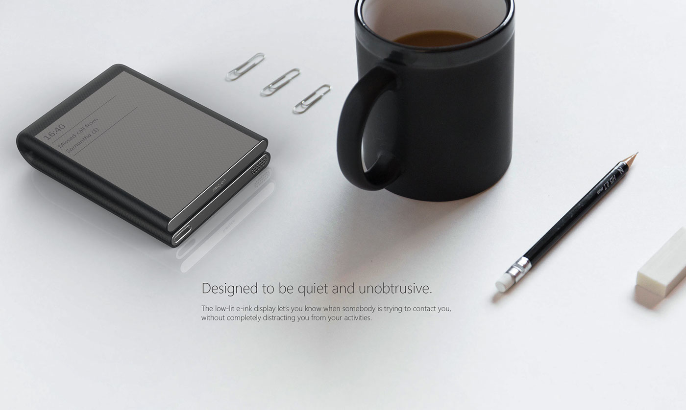
Another new concept phone slated for the heap of disposable ideas, image via abduzeedo.com

There's just one problem with this concept of a Digital Detox Phone - who needs a phone? I don't. The biggest problem I have with Canadian service providers is they are giving away talk time and long distance minutes as if it means something to me, but it doesn't. I need data. Data drives everything I do on a mobile device. The cost of talk and long distance minutes has reached the point where having a landline is meaningless (it's been that way for years). I get no value from extra talk time. My primary use for my mobile device is everything but talking. I regularly call my mom. That's it. The only other calls I get are from telemarketers, who I then block.

So why even come up with a new concept for a flip phone as a way to "digitally detox"? I don't have a better or more personal or more magical connection with people by voice than by text. A redux of a pager would make more sense to me than redesigning a flip phone, mostly because you can still buy any number of small (smaller than this design), affordable flip phones. I realize that 3D rendering apps plus the Internet have become fertile ground for any number of concepts, which is great but the fact that sometimes these ideas (which again, are all fun and great and exploratory etc) get enough traction to be posted, and reposted and shared until they show up in my newsfeed shows a profound lack of critical thinking. Let me expand on this.
Read more »

Labels: ,

Sunday, April 10, 2016

Old Growth 

image of Temperance Street, Toronto
What is it about these low-rise brick buildings that is so appealing?

Walking to work is like being in a slow tracking shot of the city. It gives you time to think and notice things. One thing I noticed was the inhumanity of some large older apartment blocks. I thought: did the people who designed these things hate people? Did they not understand people? Did they not “get” people? Why would you want to encase people in steel, entomb them in concrete or imprison people in what is supposed to be their home?


This is the type of photo I would classify as, Toronto not looking like Toronto.

Walking through St. Lawrence Market* I wondered why these older more ornate buildings were so much more appealing and comfortable? I don’t even like old things. I’m certainly no fan of antiques and old furniture and the fussiness of ornamentation. I’m a fan of contemporary and Modernist architecture, furniture and design. What I realized was I’m not a fan of the scale. It’s the inhuman scale of those ugly apartment buildings that makes them so unappealing. And not just the inhuman scale of the overall envelope but that everything is out of proportion. This is what I don’t like in Brutalist Architecture of a certain period too. Columns are too big, setbacks are too small, railings are too heavy and high and windows are like tiny archer slots or just cheap little vinyl or aluminum frames. Which is generally a problem I find with Toronto. We jumped from four to ten story buildings to 20,30 and now 70 storey buildings with nothing in between. It’s one of the main criticisms of Le Corbusier’s version of modernity. He got the scale all wrong. The taller a building is, the more space it needs around it, so it doesn't feel like it’s falling down on you, but the more space you add around it, the less humane, the more isolating the space becomes and the less like a community that space feels. Yet, proportions and ratios are what someone like Mies van der Rohe got so right and while the TD Towers may be considered stark and austere, they feel still feel comfortable and even inviting. The scale of the older city is appealing because the buildings and sidewalks and streets all feel proportionately right.
Read more »

Labels: , , ,

Tuesday, March 03, 2015

Unbearable Wearables

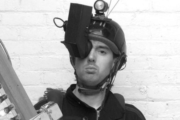
Steve Mann's early wearable computer prototype

In this episode of the NPR podcast Invisibilia, the hosts interview early wearables creators from MIT’s media lab and ask if technology is changing us. Of course, those super-nerds believe that wearing reality-augmenting tech like Google Glass only helps us be better versions of ourselves and don’t understand why people would question one form of technology over another, like say, eye glasses or shoes.

Here I got a little angry. The very pleasant hosts and creators of Invisibilia are not about challenging their interviewees as much as continuing a conversation. So I’ll challenge them instead. There is a vast and profound difference between Internet connected technology and technology that is clothing. The conversation continues that Plato argued against writing the way we do about mobile phones today, except Plato’s speculations, while somewhat true, have failed to end civilization the way fears around mobile phones are still forming.

Technology obviously changes us. Sometimes for better, sometimes for worse. At its worse, technology does break connections to other people (those in the room as opposed to strangers on the other side of the planet). It affects our “presence”. When drivers use their mobile devices, they aren’t distracted as much by pretty colours as they are by speaking to someone while they are driving. The driver’s brain is doing too much work imagining the speaker on the other end of the call to be present enough to drive a car. Drivers not on the mobile phones are encased in a bubble of glass, steel and plastic and as such are disconnected from people walking on the street. Drivers stop seeing pedestrians as vulnerable people, but more as objects through a screen on the road (if they see pedestrians at all). I think people drive worse when their windows are up because they are completely and physically separated from the world outside the vehicle. Have you ever talked to someone who keeps both earbuds in while they talk to you? Are they listening to you, or to another caller or to a song? Are they present at all or are they in their own audio bubble? Talking to someone tapping out a message on a mobile phone or laptop is equalling disconcerting. I’ve not spoken to someone reading their e-mail on Google Glass but my guess is why bother? They aren’t really there anyway. They are in another space of textual communication rather than a verbal one. Their nonverbal cues point to their focus being elsewhere.

Technology sometimes makes us break social interaction and nonverbal communication. This isn’t too dissimilar from someone with Asberger Syndrome. It's not hard to imagine that the scientists of MIT or early adopters of Google Glass were never really that good at social interaction or nonverbal communication to begin with. The reason someone coined the term “Glasshole” is because the wearer of the technology was too distracted to know they were being a-holes to begin with.

As designers we often aspire to be technology optimists, but in the area of wearables we should keep in mind not just the experience of the person using the technology but also the experience of others interacting with the wearer. It may take time for wearable etiquette to form but that doesn’t excuse us from ignoring it.

It’s a little like smoking. If you smoke, I don’t really care if your habit is killing you, just don’t take me down with you. E-cigarettes or “vaping” on the other hand may turn out to be even less healthy than smoking (hard to believe) but, so far, it seems to be pretty benign to bystanders. Google Glass will eventually be invaluable to professional users such as pilots, surgeons, forklift drivers, or film directors but because it draws attention of the eye, thus the gaze of the user stares nowhere in particular, it will always be intrusive to face-to-face conversation (oh, sorry, “F2F interaction”).


Labels: ,

Wednesday, November 12, 2014

I Remember This One Time… 


A couple of years ago, during November, I was unlocking my bike somewhere on Queen Street West when a man approached me and politely asked,
“Excuse me, but could you tell me what that is?” He was pointing to my Remembrance Day Poppy.

“This?” pointing to the plastic flower pinned to my jacket, “It’s a poppy…” I’m sure my response sounded incredulous.

“But what is it? What’s it for? Why is everyone wearing them?” He really didn’t know?

At this point, I’m guessing my face was like a kid who’d just bitten her first Brussels sprout, “It’s for Remembrance Day.”

“What’s that?”

Was this guy some kind of idiot? Was I being pranked on a hidden camera reality show? “…Armistice Day? The eleventh hour of the eleventh day of the eleventh month?”

“I’m sorry, I don’t know what that is.”

Now I became my mother, “What do you mean you don’t know what that is? Marking the end of the Great War, World War I, WWII, all wars…”

“But why the flower? Sorry, I’m not from here, I’m American”

Okay, now I was getting pretty peeved – “In Flanders field, row on row, the poppies grow (something, something)… the famous poem about war. I mean, Americans died in that war, too.”

“But we don’t have it”, now he was the one sounding indignant.

“It’s like Memorial Day,” then remembering that Memorial Day weekend was more like our May 24th, I quickly added, “or Veteran’s Day – it’s a time for remembering all those who died in war and those who served in any war.”

“Oh, okay, I didn’t know. Thanks.” and he continued on his way while I stood there thinking, “Americans?!”

I can’t say I came away from the encounter feeling good about informing a visitor to our fair city about a solemn time of year. I was honestly angry that almost every American I’ve met really expects the rest of the world to know their stupid holidays and traditions by rote, and yet they can’t be bothered to know an event their closest neighbours and important European allies follow. Come to think of it, Brits are a little the same way. They genuinely think you should give a toss about the Battle of Agincourt but are perpetually ignorant about Canadian history, politics or geography. I mean come on, it is a pretty large land mass to be completely blind to. You wouldn’t believe the shock when I tell them that Newfoundland is about half the size of Great Britain, but the combined size of the province of Newfoundland and Labrador is about four times the size of Great Britain. Yes, that is the size of one of the provinces of a country you completely ignore. Anyway, this is beside the point.

The point is two-fold. One, it is disheartening when people don’t take Remembrance Day to heart and two, that poppy pin is one of our greatest icons, yet the pin itself is unfathomably badly designed. There are so many options that it could be. The straight pin could be coiled at the top to keep the bits together. Or it could be an actual button with a clasp on the back or it could be a stamped and screened one piece plastic token like the kind you get at a museum, or alternatively a metallic one printed with a sort of flocked ink with a bendable tab which is like a more traditional pin that museums use. I don’t mean this as a design snob but as someone who thinks we should treat a cherished icon and tradition with more respect (much much more respect). Every year I think of prototyping something and it’s always too late, but this year I’m giving myself a deadline and actually going to do something about it because the people who have died in conflicts deserve better. The poppy isn’t a symbol of neo-colonialism as some wonks have said, it’s a symbol the waste of human life and the devastation that war brings and we should remind ourselves of that by treating the symbol itself a little better.

Labels: ,

Tuesday, December 03, 2013

And They Said it Couldn't Be Done 


Guggenheim Museum, modelled in icing, gingerbread, cotton candy, candy wrappers, licorice, sugar.

I'm pretty sure I had this idea first, which only goes to show, ideas are cheap, actions are money.

Food artists Caitlin Levin and Henry Hargreaves have beautifully crafted these amazing candy land versions of world famous Modern museums.

I still don't see a Farnsworth House or Philip Johnson's Glass House so I'm assuming they are still up for grabs. I call dibs - AND I get to lick the spoon!

Labels: , ,

Wednesday, February 06, 2013

Partly Unclear with a Chance of Vagueness 


Apparently, according to weather reports on television and radio, Toronto is "gonna git it" tomorrow. Prophetic warnings of commuter armageddon are forecast with dire warnings of 10-15 cm of snow during tomorrow's rush hour. Now, I realize that if you live in Newfoundland where you just got hit by storm winds that knocked out power and accumulations of 46 cm of snow, that kind of forecast is probably picnic weather. But in Toronto it really could snarl traffic, public transit and just generally suck.

Read more »

Labels: , ,

Friday, January 13, 2012

Thought-Bomb of the Day 

CUPPOW! from Paper Fortress on Vimeo.


Every once in awhile a simple idea has been conceived, devised, designed, executed and delivered. You know it's a great because a) it is so very simple; b) you can't believe you didn't think of it; and c) you almost can't believe it doesn't already exist. The
Cuppow from Aaron Panone & Joshua Resnikoff is just such an idea. I've long been a fan of using mason jars for storing rice, grains, nuts, sugar, salt and so on in air tight container. When the reckoning of Peak Oil we'll be forced by cost to stop frivolously using petrochemicals for throw-away uses such as containers and energy and start using plastics more wisely and re-thinking truly recyclable and more abundant materials such as glass and steel (though you need energy, aka petrochemicals, to make them so). The humble mason jar and all of its inherent qualities, will be something we return to. I'm not sure if the designers have thought about it, but, if I were an investor I can see possible extensions of this product. A lid with a sealable top, a lid with a sealable top for pouring things like salt, sugar or cooking oil, or a lid, perhaps made of silicone that can act as a seal during pickling or perserving that can be opened and closed without opening the lid. I'm just thought-bombing (apparently "brainstorming" has fallen out of favour due to it's use to describe neurological events… or something).

Unlike many good ideas, you can actually order one of these today at Cuppow. Go ahead. See what it's like to hold a good idea in your hand.

Labels:

Monday, October 31, 2011

Happy Halloweeny 

Spooky modernism by Pool

More and more I've been thinking of buying a few of these cheap patio chairs and cutting them up or melting them and sticking them together or just making an incredible toxic funeral pyre from them but I have to admit, it never occurred to me to make a skull chair. Chapeau, sirs, chapeau.

Labels: